For our poster we are going to make we have looked at a range of film posters of which we believe are successful and have picked out points from posters we believe influence us most.

Star Wars: Episode 1
All the star wars posters follow the same general rule where the lead character will be in focus on the front and then secondary characters follow suit towards the back. The main evil character will be in large at the back as well. This part is what influences us most where we think it will be a good idea to have our Main protagonist at the front, and our doner/magic helper will be at the back (the blue man)
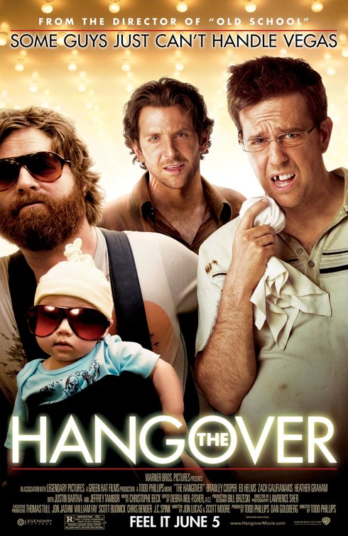
The Hangover
This poster follows general codes and conventions too. It contains the movie tag line and will also contain some information on the makers, if they are already made by another movie. It also has the main protagonists in centre frame, which instantly shows the audience that these will be the people they will be following in the film. The Block at the bottom is also what we will be taking example from with the layout of out poster.
Benjamin Button
 We like the layout of this poster as well. It has the conventions of a film where two characters have a strong bond/interaction with each other. It is set out so they are side by side, like a couple, and also only half of each face is shown, making it seem like they are two halves and when together, make a whole. This is usually in romantic films, but can also be used in dark thrillers and other type of films. We may carry on this idea as we believe that our Two main protagonists share a strong connection.
Magazine
 Looking at a few film magazines such as Empire, Film and Sky Movies we decided that if we were going to write our film review then wed have to have a large double page spread, generally filled with pictures. Also the language will be rather informal, as if talking to the reader as a friend.
The layout of our magazine will bi similar to Empire mainly. A large picture will take up about half the article and the rest will have the review. Side bits such as directors quotes and facts will be dotted over the picture.
All the star wars posters follow the same general rule where the lead character will be in focus on the front and then secondary characters follow suit towards the back. The main evil character will be in large at the back as well. This part is what influences us most where we think it will be a good idea to have our Main protagonist at the front, and our doner/magic helper will be at the back (the blue man)
The Hangover
This poster follows general codes and conventions too. It contains the movie tag line and will also contain some information on the makers, if they are already made by another movie. It also has the main protagonists in centre frame, which instantly shows the audience that these will be the people they will be following in the film. The Block at the bottom is also what we will be taking example from with the layout of out poster.
Benjamin Button
We like the layout of this poster as well. It has the conventions of a film where two characters have a strong bond/interaction with each other. It is set out so they are side by side, like a couple, and also only half of each face is shown, making it seem like they are two halves and when together, make a whole. This is usually in romantic films, but can also be used in dark thrillers and other type of films. We may carry on this idea as we believe that our Two main protagonists share a strong connection.Magazine
The layout of our magazine will bi similar to Empire mainly. A large picture will take up about half the article and the rest will have the review. Side bits such as directors quotes and facts will be dotted over the picture.